Case Study: Transforming spreadsheets into enhanced interactive experiences
I have built this project for a global energy company workshop. Such as in a roadshow setting, the hosts needed to conduct the audience through many different pieces of content to display
relevant information. The main problem though was the amount and format of the original content: the content was organised in a single PowerPoint with several slides with tables.
Some considerations of this project were the room's enhancements adding to the overall experience, such as a big touch screen and Lighting. Part of the briefing was also the chair's
disposition and the dynamics of the conversation, which influenced the goods the participants would take away.
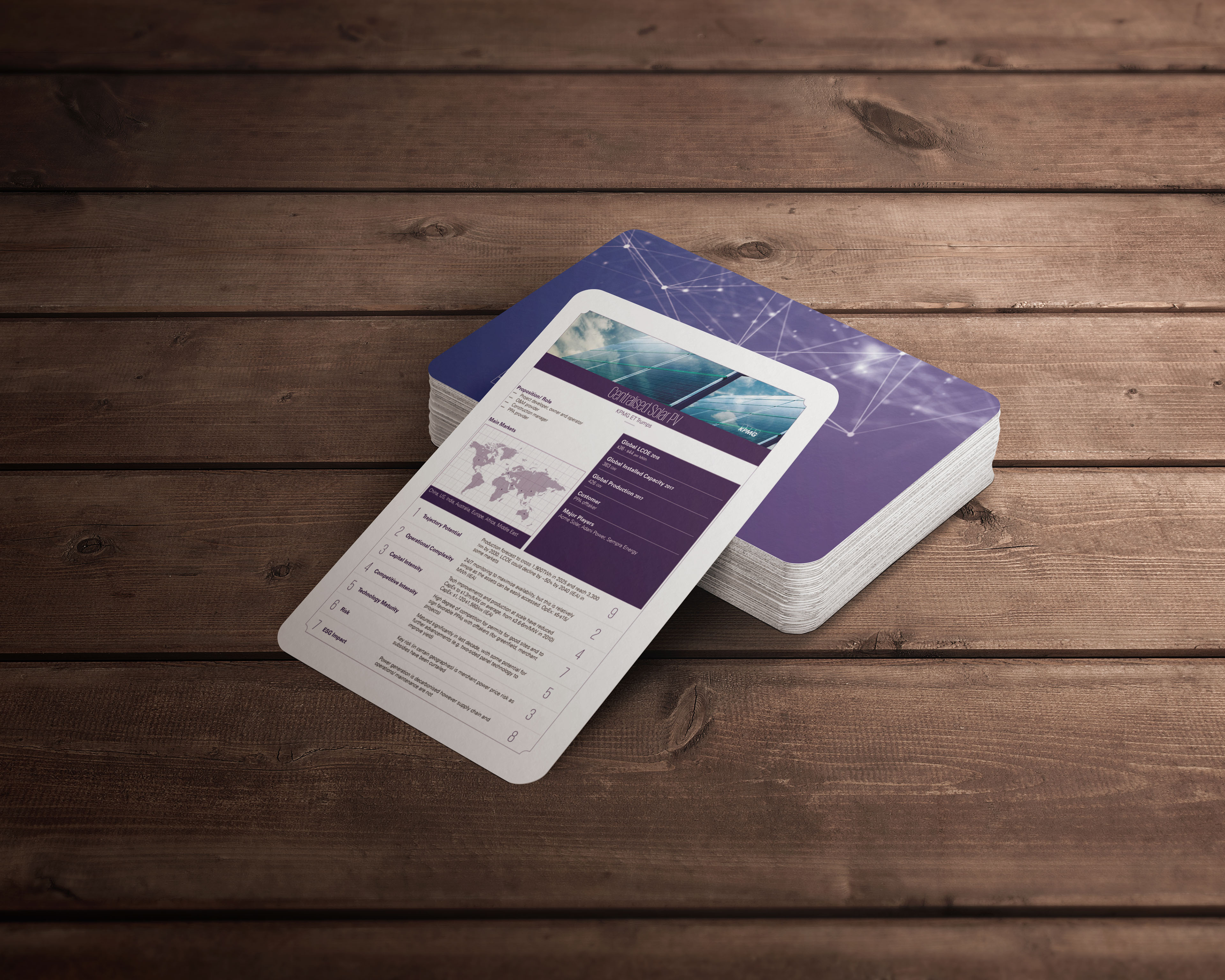
I have built bespoke interactive content to utilise the touch screen, designing the overall look and feel for the other collateral the audience received. Additionally, I delivered a bespoke
deck of cards, as displayed below.
Press play on the header of this page to watch the complete video.

The premise of my work was first to understand the room's enhancements that would add to the overall experience, and then tailor the contents to justify it. The room counted with a big touch
screen, that could host files such as in a whiteboard, although this proved to be a very poor experience. My main goal then turned to build bespoke interactive content to fully utilise the
touch screen, without its native software. As a secondary goal, I needed to make sure the audience would carry a takeaway.
The Challenge
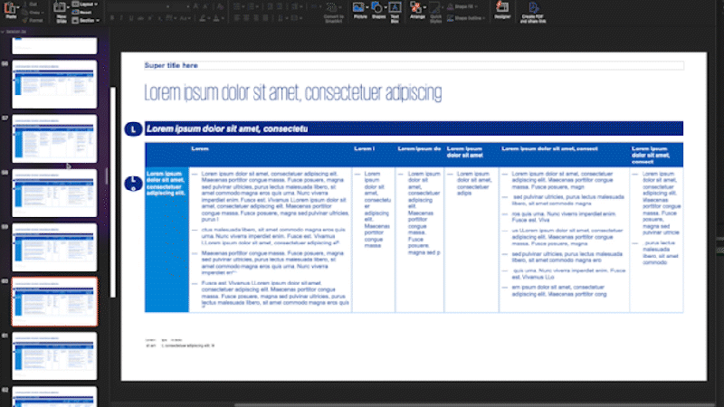
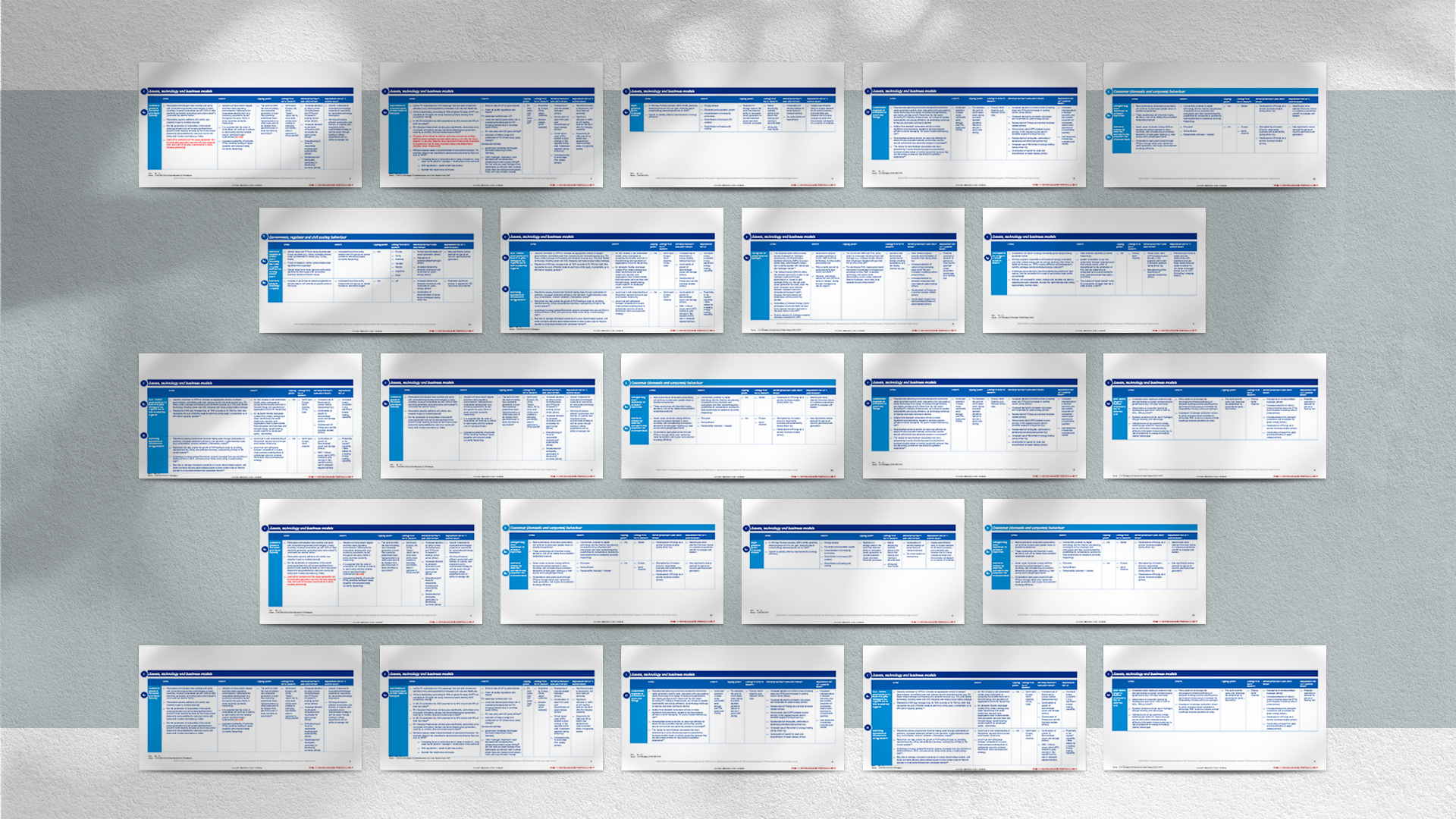
The raw content presented was a collection of tables inserted in a PowerPoint file, as demonstrated in the following images. Transforming many table slides into a visually engaging
presentation would have been impossible without a plan: identifying patterns within the contents.
Noticeably, the trend titles on the left side of the slides are repeated on the right column of subsequent slides, illustrating their interconnectedness. Similar patterns emerged
throughout the document, such as countries and themes that could be represented using icons or simpler visualisations.
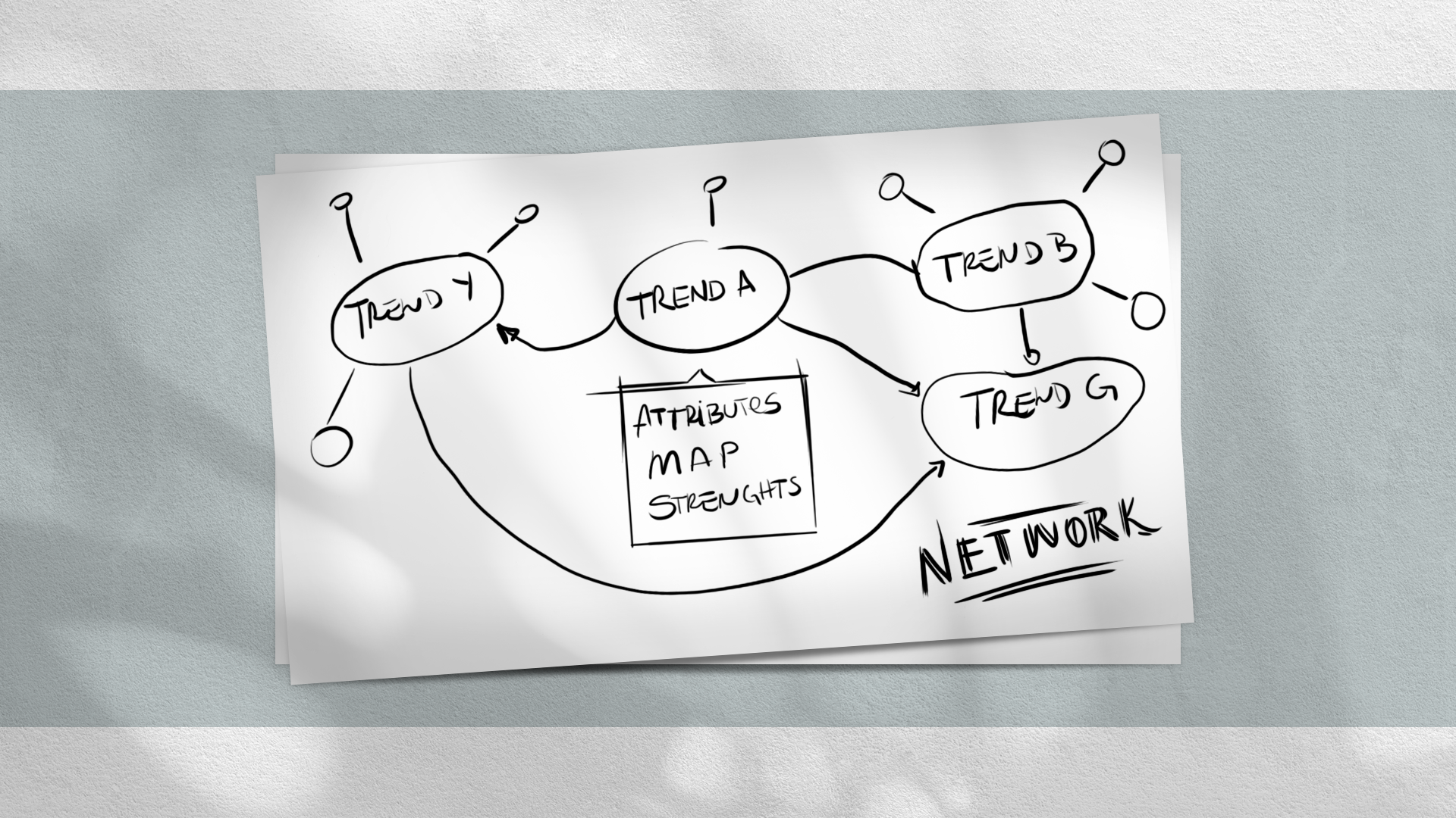
To ensure an effective presentation, it was crucial to minimize text and simplify the spreadsheet across multiple slides. With the patterns, I managed to build a network map, where each
trend could be an interconnected node.

Enhanced Results
I have built the touchscreen experience, using a range of software and bespoke coding, enhanced with motion graphics. The experience was rooted in the sponsor brand but was designed to
be animated and interactive, deviating from the traditional "slide-after-slide" PowerPoint format.
The experience allowed the presenter to touch on selected themes and drill down into further trend information. The relationships between different themes were visually represented using
line connectors in a network map, enabling the presenter to visualise trends at any point during the workshop. Finally, as a last touch, I have also delivered a deck of cards as a session
takeaway, so the participants could revisit parts of the content and the main pain points, gamefying the experience.
Press play on the header of this page to watch the complete video.